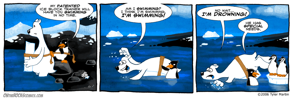
Those are chinstrap penguins in the last panel. They are a very abundant species of penguin. They are found on the southern islands as well as the Antarctic Peninsula. They are just a bit smaller than adelies and are easily recognizeable by the line across their “chin” that looks like its strapping on a little helmet on their head.
Comments On the Different Art Style
Thanks for all the feedback on the art yesterday. I got sick Monday night, and didn’t feel good all day yesterday, so that’s why the comic is late today. Some 24 hour bug caught up with me. So I’m probably not feeling right in the head enough to even address this now.
Doing this artsy style was my plan for side stories, done in comic book format, like Wally’s origin story and such. But on Monday, I was just sitting down to do the comic, and I had just gotten done with that tedious project I was on, and I sat there looking at the screen, and there was just no motivation to do it. It is vector art and for me that is pretty tedious. I have a drawing tablet for the computer, but creating the comic that way requires very little of using it. It’s basically copy-and-pasting the same objects and then maybe redrawing Wally’s arms. It’s tedious and often limits me. Not that vector art is limiting, I’ve slowly taken it further, it’s the not enjoying it part that limits me. Or reusing the same positions because they are easily available. Often I’ll see what comics I have written and pick the easiest one to do, one where I can copy exact Wally’s and Osbournes from previous comics.
It’s not so much about how the comic looks to me. I enjoy both styles. I think the clean simple vector look delivers the simple humor of the comic well. On the other hand, the hand drawn way has a more personable feel and is more interesting to look at. An attractive scene in a comic can sometimes compensate when the joke is not so strong.
The vector look has a certain consistency to it I enjoy. My main motivation for doing it was that I don’t usually like drawing the same characters over and over, and it would be easy to copy and paste the comic, since it was just a side project I thought that would be the least time consuming. But as the comic progressed, it took longer and longer. Reusing stuff is quick, but I kept needing new stuff, and a lot of my humor is physical so I couldn’t just have the characters always standing around. Often I would not add little details I would if drawing by hand, something that is a few quick strokes with a pen can be time consuming construction with vector graphics.

Here’s the vector art in wireframe mode. Looks like I’m working on a 3-D computer animated movie.
So it doesn’t really come down to how the comic looks best for the comic unfortunately. It comes down to my enjoyment in creating it. Being the sideproject that it is still, the enjoyment in creating it for me is still the most important factor, well, as long as it is still enjoyable to read by readers (otherwise there would be no point in having it on the web). And I’m enjoying creating it by hand, instead of the through the use of “robotic arms”. I’m enjoying being able to touch the comic, and have it right there in front of me as a real object. The freedom a real pen gives, even the errors it produces with me at the helm.
Maybe it will just be a phase and I will tire of this style and return to the vector. Maybe I will develop it, maybe I’ll come up with a happy medium between the two. I don’t know, but I’ve just decided to allow myself to have fun with it and see where it takes me. Maybe that frame of mind in itself will help me take the comic new places too.
As far as how it will work in a book, I don’t know, I didn’t pick a good spot to make such a switch, I’ll figure that out later. Hang in here with me. 😉
31 Comments
Leave a response


what kind of penguins are those in the third panel?
Very nice comic! The different style is quite cool
They’re chinstrap penguins, I’m adding the news post now that covers it.
I really like this merge of the two styles you did with the comic today. =) Very nice!
I liked it better when you had the comics in a differrent kind of artwork than the one you have now. Can you change that?
I was waiting for you to mention chinstraps
I liked the non-vector art twice as much. Before my current comic I tried a run at vector based strips and I had no love for creating them at all, so I can feel what you’re saying. I think you do a fantastic job with the vector art, so I won’t like the comic any less if you stick with it, just wanna give another nudge for them looser lines.
I like both styles for having the comic. And I also hope that you are feeling better. 😉
I like both styles too, the vector style worked well with the simple yet funny humor but I do find this style much nicer artistically. The way the vector comics didn’t change over time is certainly nice though, there are some comics I can’t go back to the start and go through the whole story anymore because the characters just don’t seem the same as the ones I know. This style does look like it gives you more freedom though especially with expressions which is nice.
Regardless of the style you use as long as it has penguins in it then I’ll read it 😀
I’m not a big fan of vector art, I prefer hand made one, although I’m very good at vector art ( which comes from the fact I can make anything go my way ) I still prefer wasting 4-5 times the time to draw the same thing with my own two hands 🙂
How did you color this? The reflections in the water are awesome!
i either have to get used to the new art style or i dont like it
Tyler, I went through the same struggles with Toyzville. I switched to hand-drawn early on, after the first dozen or so. I was so unhappy with it, I went back to vector. THEN, just like you, I got bored and felt I was “cheating” somehow with all the copy/paste. You nailed it all right on the head. To those readers that don’t care for the new style, give it a few weeks and either you won’t be able to tell much of a difference between vector and hand-drawn, or Tyler’s new-found enjoyment will have On the Rocks blowing us all away. I am quite positive of the latter… Keep up the great work and I hope you are all better now.
I’m glad you’re feeling better Tyler. I like the vector style better, but this style is good too, ether way, I will still love the comic! special needs, hehe. 😀
I don’t really post at all, but I thought your honest comments on this new style deserved a response from all your loyal readers.
I noticed immediately that you seemed to have much more freedom (or as it turns out, desire) to place Wally and Osbourne in new and interesting positions when doing the comic strips by hand. I admit the strip has a somewhat different feel, but I don’t think that’s necessarily a bad thing.
I’ve been reading this and other web-comics and have seen many transitions in the style of art used over the years. I believe you have to be able to grow and improve upon your work.
Whether it be online gaming (/lick), or a web-comic, I’ve always been a huge supporter of doing what is enjoyable for the individual. If you can’t have fun with something, then you’ll lose the original passion and your performance will suffer because of it.
I guess what I’m trying to say is… If this new style means you’ll continue to create more lovable comics that we’ve all grown to enjoy, then I’ll support you 100%.
Oh and seeing the wireframe animations is an amazing glimpse behind the scenes of making a web-comic. Very cool.
Also, your comment about “The freedom a real pen gives, even the errors it produces with me at the helm” got me thinking that it would be hilarious to see some Wally and Osbourne bloopers or out-takes. (ala Toy Story, etc) 😀
I’m also a fan because of the penguin, and his buddy Wally – and always will be, first and foremost.
I don’t draw, but do make things with my hands and have been enjoying comparing how things look different. I’m really enjoying the learning aspect of your all around efforts – more about penguins, the Antartica, and now about drawing and the more artistic aspects of your craft. It’s the total “thingy” that makes stopping by here daily like no place else.
Thanks. 🙂
Hope you’re feeling better.
Well, well……..I didn’t realize that vector drawing acually takes away an artists creativity and puts it in a format that you pictured in the wireframes above…little did I know. That puts a different light on the subject.. I would say follow your heart, then……Nevaren has some good points about “doing what is enjoyable to the individual”. So also did Larry when he said “give it a few weeks”.
@Tyler:
awesum work on the strip but the water is freain amazing…it looks like you’ve used sum 3D software to create it wally and osbourne look to standoutish what i’mtrying to say is that umm… the water looks so amazing that wally and osbourne look kind dull in comparison. but this styl still rox n the strip is as funny as ever. And for what my opinion’s worth u coud use stivk figures if the strips are as funny as today..well let me try 2 clarify….Me Like On The Rocks. Me Think It Cool No Matter What.
P.S.
Incase You Havent Figured It Out I Suck At Trying To Get Points Acroos To People. 😀
Wally….Wally is that you? I here yah Tyman and I appreciate all thoses points you made but this just doesn’t feel like Wally to me, not as much anyway. The sceene is very beautiful very What Dreams May Comish, I agree with SuperVegito about the fact that the background has more going for it than the characters. I have to say though that Osbourne looks great, can you just make Wally more Wally I have the wallpaper of him on his magic rainbow and to me that is Wally this is like his cousin filling in. Props for creativity nonetheless you still know how to make me laugh : )
Okay so after I made that coment I realized how stupid I am. You have more talent in one little half chopped off pinky than I have in my whole body! I don’t want to be one of those people who gets all stuck on something and is so afraid of change and development that I can’t appreciate something really good. I lack vision, heh heh. But please take it as a compliment that you did such a good job with your comic that the characters are real to me and I have already become sentimental.
I really appreciate everyone’s comments and input on the art. I’m feeling much better today too as far as being over being sick. Keep in mind that there are no solid changes, just having fun experimenting this week at your expense. It’s just as important to me as you that Wally & Osbourne remain the same characters we know and love. 😉
I really do like the new style, I always felt Osbourne just didn’t have expressions fitting what he was saying. They seem to be coming through now with the new style, very suave 😀
Okay, ready for some more comments? I think the new style’s okay, but it has kind of a dark feel to it. I really think it takes some of the humor out of the comic. It might be good for certain special scenes, but it doesn’t hurt to use two styles, you know?
Boy, you go messing with peoples medication you get all kinds of reactions. I thot Wally was just having a bipolar episode. Either way I’m in.
I really like the backgrounds in this new style, but I prefer the clean look of the characters in the original style. How about trying a combo? Like maybe do the characters the old way and I dunno, render them somehow fuzzier so they don’t look out of place in the backgrounds drawn in the new style. Does that make sense? I think it would be cool!
Other Fun Stuff
This page is full of facts from all over the world.
Enter first column content here
Enter second column content here
Enter supporting content here
200 million years in the making!
I like wally’s old eyes better!
whera’s Osbourne’s outfit???
I like the old versions better, because they look sort of neater (if you know what I mean) but they thy’re all just as funny.
I dont like the ones in pastel.